#install.packages("devtools") # run this only if you don't have devtools installed
#devtools::install_github(repo = "TheoreticalEcology/EcoData",
#                          dependencies = T, build_vignettes = T)

# also install the 'broom' package
#install.packages("broom")

## bring the libraries into R
library(EcoData)
library(tidyverse)
library(broom)

## understand a bit about this package
vignette("EcoData", package="EcoData")

## bring the airquality data into the environment and understand a bit about this data
airquality <- airquality
?airquality5 Statistical Inference
Week 5 - A refresher of regression, two independent samples t-test and one-way ANOVA
In this workshop, you will review three statistical inference techniques used in analysing simple data sets. These methods are simple regression with a single numeric (and preferably) continuous explanatory variable, the two independent samples t-test and one-way ANOVA. Workshop materials are available in the github repository ECS200.
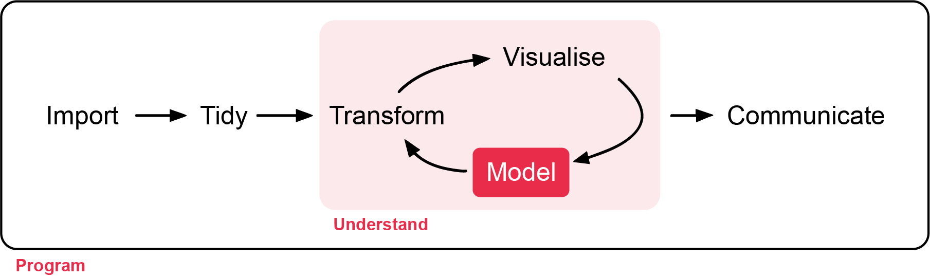
Today’s task will be a refresher on the following:
- Regression
- Two independent samples t-test
- One-way ANOVA
For each, you will need to understand about intercepts, slopes, p-values, assumptions of equal variances, assumptions of independence, and assumptions that the residuals have a normal distribution.
Background
Background
Simple linear regression is a statistical technique used to describe and quantify the relationship between two numeric (and preferably continuous) variables. In ecological research, it is commonly applied to examine how an environmental predictor influences a biological response. For example, an ecologist may wish to determine whether plant biomass increases with soil nitrogen availability or whether bird abundance declines as distance from a forest edge increases. We will explore more complex regression modelling, later in the unit.
In this section we will investigate the relationship between Temperature (degrees F) and *Wind (mph) in New York, May to September 1973.
If needed, install the EcoData packages from github.
Research question and setup
The research question is: Is there an association between temperature (treat this as the explanatory variable) and wind?
To go from the English language research question to being ready to approach this question statistically we need to do a few things, namely:
Decide on a suitable model: Here we are going to start with the belief that a simple straight line model will be suitable
State the null and alternative hypotheses
Decide on the significance level
Optional: If you would like to have a go at any of these you are welcome to do so, otherwise you can unhide our version detailed below.
Show answer
Regression equation (in context): \(Wind = \beta_0 + \beta_1 Temp + \epsilon, \epsilon \sim N(0, \sigma^2)\)
Null hypothesis (\(H_0\)): \(\beta_1 = 0\), there is no association between temperature and wind in New York the summer of 1973
Alternative hypothesis (\(H_1\)): \(\beta_1 \ne 0\), there is an association between temperature and wind in New York the summer of 1973
We will evaluate these with a significance level (\(\alpha\)) of 0.05 as this is standard sciences research question.
Visualisation of the data
The figure below provides an overview of three key descriptions we should include when presenting any scatterplot. Additionally, if extremes or potential outliers are present these should also be described and checked for validity (data entry mistake, measurement errors, units not a part of the population of interest, etc).
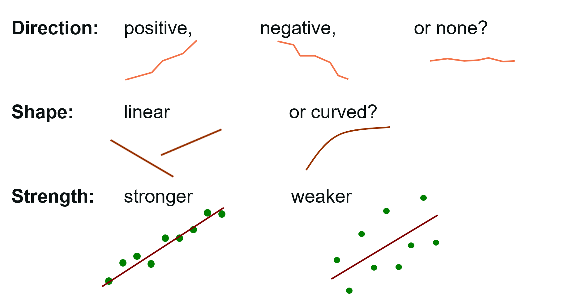
Let’s visualise the data with the aim to check if a linear relationship is suitable and to describe the data (shape, direction, strength and potential extremes).
ggplot(data = airquality, aes(x = Temp, y = Wind)) +
  geom_point() + ## points for a scatterplot
  theme_minimal() +
  labs(title = "Scatterplot of temperature and wind (summer, 1973, New York)",
       x = "Temperature (degrees F)",
       y = "Wind (mph)")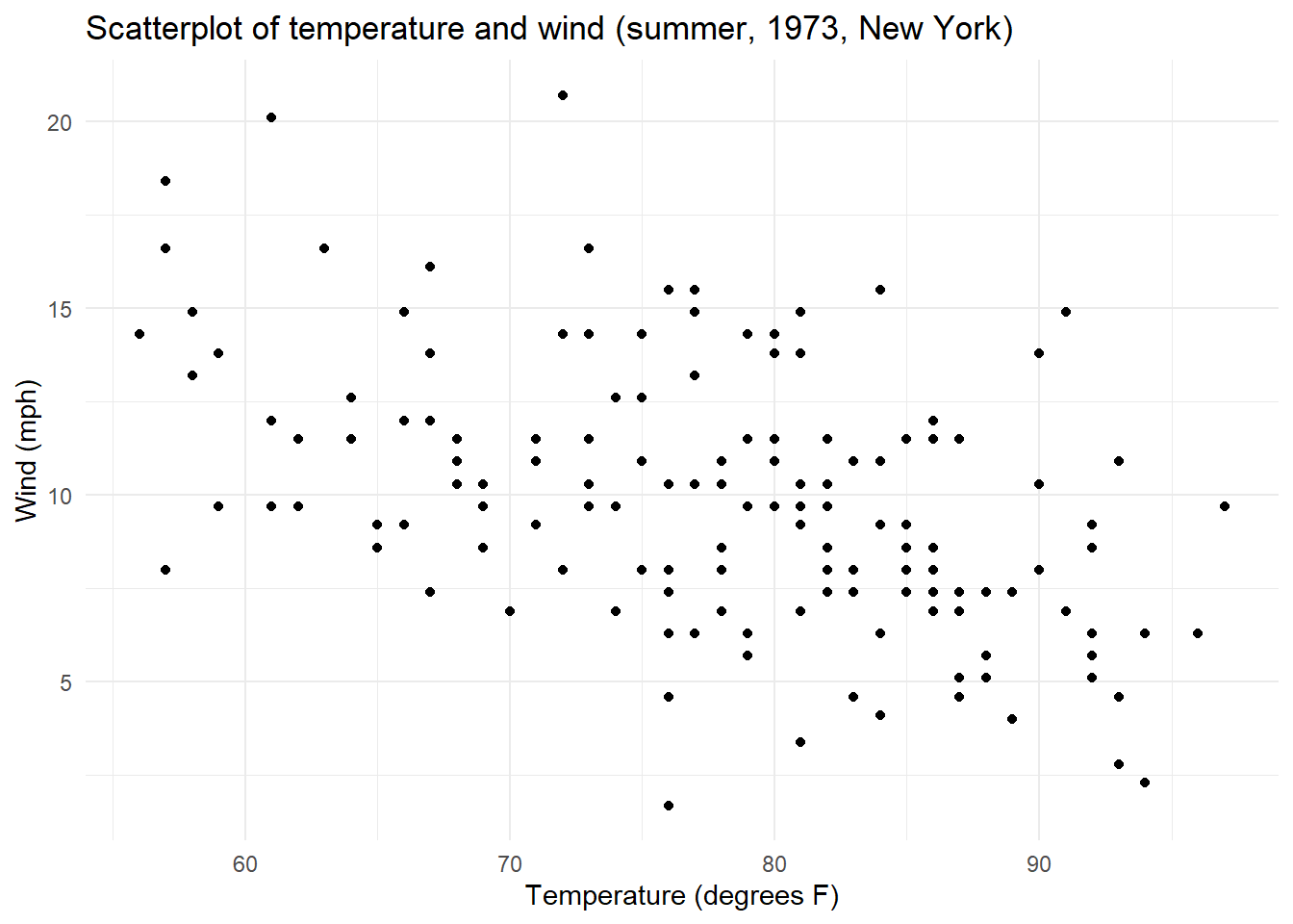
Optional: We recommend you have a go at describing the scatterplot, then you can unhide our version detailed below.
What is the relationship you see when plotting Temperature with Wind speed?
Show answer
This relationship appears linear, negative and moderate with no potential extreme values.
Assumptions
Let’s create the additional visualisations to allow us to evaluate the assumptions.
The figures below are as follows:
The fitted values versus the standardised residuals. In this we are looking for an indication that there is change in the standardised residuals over the range of the fitted values to support an assessment of the assumption of equal variances. There should be an equal number of residual above zero and below zero, and not too many standardised residuals more extreme than -2 and 2.
A quantile–quantile (QQ) plot is a visualisation used to check whether a set of values (say residuals from fitting a linear regression model) follows a particular distribution (say the normal distribution). The QQ plot which compares the theoretical quantiles from the normal distribution (x axis) and sample standardised residuals presented as quantiles (y axis) and is used to assess if the residuals are normally distributed. If the points follow the line then this is consistent with the residuals coming from a normal distribution. Systematic curvature (an S-shape) suggests the residuals may be skewed or have heavier or lighter tails than a normal distribution while a few points far from the line at the ends may indicate outliers or unusually large residuals.
Optional: The plot of leverage versus the standardised residuals allows us to check if there are any large leverage points (leverage is how far a data point’s predictor values are from the “center” of all predictors) which also have large residuals. If there are any points with a large leverage and large residuals, these points are having an impact on the model and should be investigated further.
## Firstly run the model
aq_t_w_lm <- lm(Wind~ Temp , data = airquality)

## Secondly create a set of visualisations that help us understand the diagnostics
### Get several key outputs including:
### - fitted values (.fitted)
### - standardised residuals (.std.resid)
### - leverage (.hat)
airquality_aug <- augment(aq_t_w_lm)

ggplot(airquality_aug, aes(x = .fitted, y = .std.resid)) +
  geom_point() +
  theme_minimal() +
  geom_hline(yintercept  = 0)+
  geom_hline(yintercept  = c(-2, 2), linetype  =3) +
  labs(title = "Airquality (temp and wind), fitted values versus standardised residuals",
       x = "Fitted values",
       y = "Standardised residuals")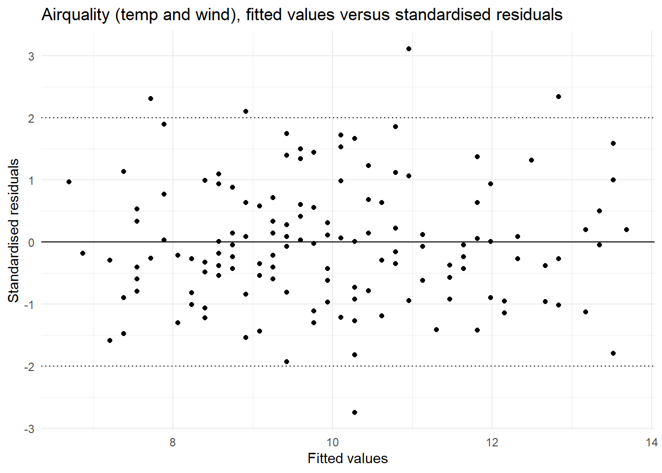
ggplot(airquality_aug, aes(sample = .std.resid)) +
  stat_qq() +
  stat_qq_line() +
  theme_minimal() +
  labs(title = "Airquality (temp and wind), QQ plot of the residuals",
        x = "Theoretical Quantiles",
       y = "Standardised residuals")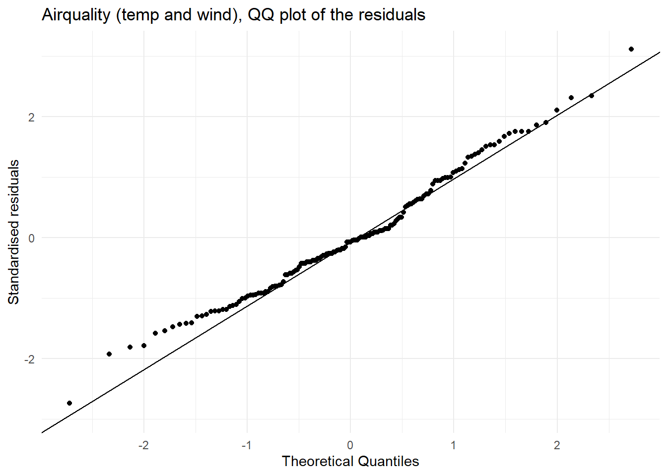
ggplot(airquality_aug, aes(x = .hat, y = .std.resid)) +
  geom_point() +
  theme_minimal() +
  labs(title = "Airquality (temp and wind), leverage versus standardised residuals",
        x =  "Leverage",
       y = "Standardised residuals")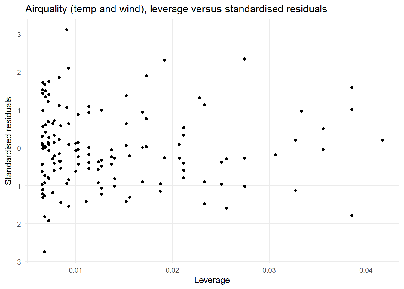
| Assumption | Check | Met |
|---|---|---|
| Linearity | In the scatterplot of Temperature and Wind we see a linear relationship | This assumption is met. |
| Equal variances | In the plot of fitted values vs the standardised residuals we see a similar spread of residual for all fitted values. | This assumption is met. |
| Normally distributed residuals | In the QQ plot we see that there is good agreement between the theoretical and observed standardised residuals. | This assumption is met. |
| Influential points | In the plot of leverage versus the standardised residuals the points with the largest leverage (influence) have small residuals | We do not have any concerning (high leverage) observations. |
| Independence | This data is from a summer in New York which is time series data, there may be some concerns about independence | This assumption needs a caveat. |
This analysis can proceed with a caveat on independence.
Modelling
We can now get R to summarise and visualise the model so we can review.
## summarise the model
summary(aq_t_w_lm)
Call:
lm(formula = Wind ~ Temp, data = airquality)

Residuals:
    Min      1Q  Median      3Q     Max
-8.5784 -2.4489 -0.2261  1.9853  9.7398

Coefficients:
            Estimate Std. Error t value Pr(>|t|)
(Intercept) 23.23369    2.11239  10.999  < 2e-16 ***
Temp        -0.17046    0.02693  -6.331 2.64e-09 ***
---
Signif. codes:  0 '***' 0.001 '**' 0.01 '*' 0.05 '.' 0.1 ' ' 1

Residual standard error: 3.142 on 151 degrees of freedom
Multiple R-squared:  0.2098,    Adjusted R-squared:  0.2045
F-statistic: 40.08 on 1 and 151 DF, p-value: 2.642e-09confint(aq_t_w_lm) 2.5 % 97.5 %
(Intercept) 19.0600210 27.407355
Temp -0.2236649 -0.117264## visualise the model
ggplot(data = airquality, aes(x = Temp, y = Wind)) +
geom_point() + ## points for a scatterplot
geom_smooth(method = lm, se = F) +
theme_minimal() +
labs(title = "Scatterplot of temperature and wind (summer, 1973, New York)",
x = "Temperature (degrees F)",
y = "Wind (mph)") `geom_smooth()` using formula = 'y ~ x'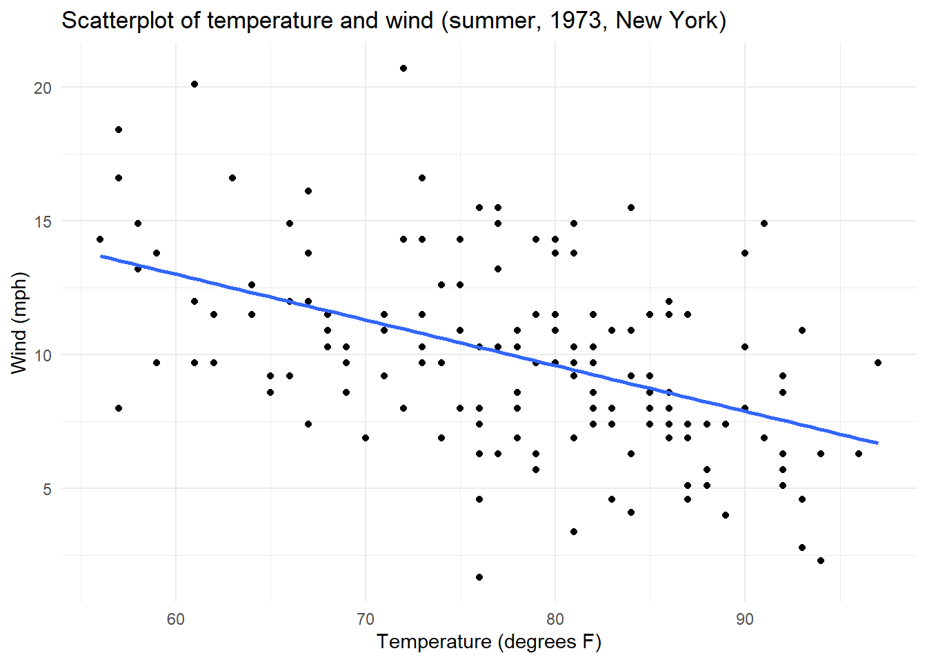
In looking at the output from R we see that a simple linear regression model was fitted to examine the relationship between temperature (Temp) and wind speed (Wind) in the airquality dataset. We will focus on understanding the coefficients and the R-squared. The fitted model can be written as:
\(\widehat{Wind} = 23.23 - 0.17 \times Temp\)
The intercept (23.23) represents the estimated wind speed when the temperature is 0 degrees. The slope coefficient for Temp is −0.17, indicating that for each one-degree Fahrenheit increase in temperature, the expected wind speed decreases by approximately 0.17 miles per hours, on average. If the model assumptions hold, we are 95% confident the true intercept lies between -0.233 and -0.117.
The coefficient for temperature is statistically significant (the probability value or p-value is small, \(p < 0.001\)), providing strong evidence that temperature is associated with wind speed in this dataset. The model has an \(R^2\) value of 0.21, meaning that approximately 21% of the variability in wind speed is explained by temperature.
In preparation for more advanced modelling, we note that the overall F-test for the model is significant (\(F(1,151) = 40.08\), \(p < 0.001\)), indicating that the regression model provides a better fit to the data than a model with no predictors.
Report ready interpretation
A full interpretation of a regression model includes
- A conclusion with respect to the null hypothesis, supported by a p-value
- A summary of what we learn from the modelling (slope and associated confidence interval)
- Any assumptions or caveats made along the way
- Optional: Interpretation of r-squared
For this model we have the following interpretation:
We have evidence against the null hypothesis that there is no relationship between temperature and wind (p-value <0.001). For a one degrees Fahrenheit increase in temperature we see a 0.17 miles per hours decrease in wind (95% CI 0.11 to 0.22). 21% of the variation in temperature can be explained by wind. This assumes that these days in the summer of 1973 are representative of all days in New York.
Background
The two independent samples t-test is a statistical technique used to compare two groups, specifically we test of the mean of the two groups could be the same or if the two groups require separate means (the two groups are different statistically). In ecological research, this would be useful for comparing two groups such as a native and restored vegetation.
In this section we will investigate the impact of invasive species on the number of native species observed, by quadrant, comparing an area with this invasive species and an area without it.
## bring the libraries into R
library(tidyverse)
library(psych)

## bring the data into R from GitHub
invaded <- read.csv("https://raw.githubusercontent.com/nicholaswunz/ECS200-Workshop/refs/heads/main/data/invaded.csv", stringsAsFactors = T)
As this data is simulated for the purposes of learning we will focus on the process running a t test in R and how to write an interpretation.
Research question and setup
The research question is: Has there been an impact of the invasive species on the number of native plant species at the quadrant level?
Exercise 2 (2 min)
🧪 Write the null and alternative hypothesis for this data. Select a significance level
Show answer
Null hypothesis (\(H_0\)): \(\mu_{invasive} = \mu_{native}\), the population means of the number of native plant species in the quadrants in the areas with the invasive species and without the invasive species are the same.
Alternative hypothesis (\(H_1\)): \(\mu_{invasive} < \mu_{native}\), the population means of the number of native plant species in the quadrants in the areas with the invasive species is less than the number in the areas without the invasive species.
We will evaluate this with a significance level(\(\alpha\)) of 0.05.
Visualisation of the data
Look at the data, then visualise the data to understand it, check for extremes and check the assumptions of a two independent samples t-test. We will also calculate some descriptive statistics.
## look at the data a couple of different ways
glimpse(invaded)
Rows: 44
Columns: 2
$ Group <fct> Invaded, Invaded, Invaded, Invaded, Invaded, Invaded, Inv…
$ Native_count <int> 11, 12, 18, 13, 13, 18, 14, 9, 11, 12, 17, 14, 14, 13, 11…summary(invaded) Group Native_count
Invaded :22 Min. : 7.00
Uninvaded:22 1st Qu.:12.00
Median :14.00
Mean :14.43
3rd Qu.:17.00
Max. :22.00 ## the descriptive stats using the 'psych' package
psych::describeBy(invaded$Native_count, invaded$Group, mat = T) item group1 vars n mean sd median trimmed mad min max
X11 1 Invaded 1 22 13.09091 2.893492 13.0 13.11111 2.2239 7 18
X12 2 Uninvaded 1 22 15.77273 2.653512 15.5 15.72222 2.9652 11 22
range skew kurtosis se
X11 11 0.1276529 -0.5341751 0.6168945
X12 11 0.1899428 -0.4749402 0.5657306## try both histograms and a comparative box and whisker plot to see which is nicer
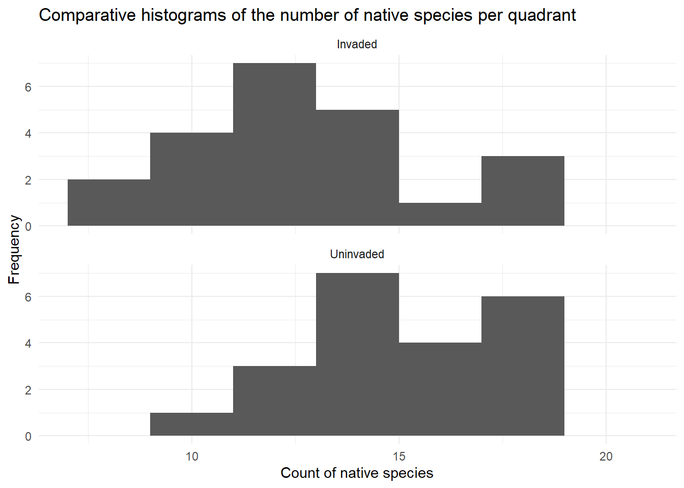
ggplot(data = invaded, aes(x = Native_count)) +
geom_histogram(breaks = seq(7,22,2)) +
facet_wrap(~ Group, ncol = 1) +
theme_minimal() +
labs(title = "Comparative histograms of the number of native species per quadrant",
x = "Count of native species",
y = "Frequency"
)
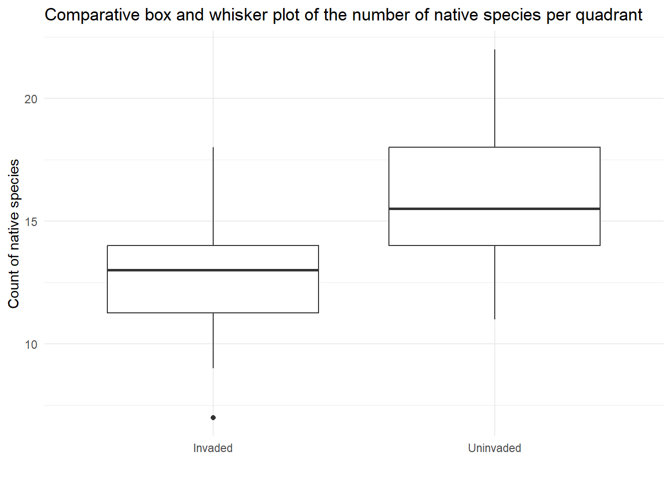
ggplot(data = invaded, aes(x= Group, y = Native_count)) +
  geom_boxplot() +
  theme_minimal() +
  labs(title = "Comparative box and whisker plot of the number of native species per quadrant",
       x = '',
       y = "Count of native species",
       )
Assumptions
| Assumption | Check | Met |
|---|---|---|
| Equal variances | In the plots the spread looks similar in the two groups (invaded and uninvaded) and the standard deviations are similar (2.89 and 2.84 for invaded and uninvaded respectively) | This assumption is met. |
| Normally distributed residuals | Histogram suggests the data is symmetric to some extent and fairly bell-shaped measurements for both groups, and the sample size is the same in each group. | This assumption is met. |
| Independence | This data simulated, we can assume independence. | This assumption is not relevant. |
Modelling
## Run the t test, account for the one-side alternative hypothesis
t.test(Native_count~ Group , data = invaded, alternative = c("less"))
    Welch Two Sample t-test

data:  Native_count by Group
t = -3.204, df = 41.689, p-value = 0.001299
alternative hypothesis: true difference in means between group Invaded and group Uninvaded is less than 0
95 percent confidence interval:
      -Inf -1.273746
sample estimates:
  mean in group Invaded mean in group Uninvaded
               13.09091                15.77273
Report ready interpretation
A full interpretation of a analysis includes
- A conclusion with respect to the null hypothesis, supported by a p-value
- A summary of what we learn from the modelling (samples means)
- Confidence interval for the differences
- Any assumptions or caveats made along the way
For this model we have the following interpretation:
We have evidence against the null hypothesis that the population means of the number of native plant species in the quadrants in the areas with the invasive species and without the invasive species are the same (p-value 0.001).
The mean count of native species is 13.1 for the invaded group and 15.7 for the uninvaded group. This was simulated data but no further assumptions were made during analysis.
Background
A one-way analysis of variance (ANOVA) is a statistical technique used to compare the means of three or more groups. Specifically, it tests whether all groups could share the same population mean or whether at least one group has a different mean from the others. In ecological research, this would be useful for comparing several groups, such as plant growth in native, restored, and degraded vegetation sites.
In this example we will focus on the effects altitude on species richness using simulated data with three altitude bands: low, mid, and high elevation.
## bring the libraries into R
library(tidyverse)
library(psych)

## bring the data into R
altitude <- read.csv("https://raw.githubusercontent.com/nicholaswunz/ECS200-Workshop/refs/heads/main/data/altitude.csv", stringsAsFactors = F)

## make altitude a factor with the ordering low, mid and high
## Note: R otherwise will use alphabetical ordering

altitude <- altitude %>%
  mutate(Altitude = factor(Altitude , levels = c("Low", "Mid", "High")))
As this data is simulated for the purposes of learning we will focus on the process running one-way ANOVA in R and learning how to write an interpretation.
Research question and setup
The research question is: Has there been an impact of altitude on the plant species richness?
Exercise 2 (2 min)
🧪 Write the null and alternative hypothesis for this data. Select a significance level
Show answer
Null hypothesis (\(H_0\)): \(\mu_{low} = \mu_{mid} = \mu_{high}\), the population means of the number of plant species in low, mid and high altitude regions are the same.
Alternative hypothesis (\(H_1\)): At least one altitude region is different.
We will evaluate this with a significance level(\(\alpha\)) of 0.05.
Visualisation of the data
## look at the data a couple of different ways
glimpse(altitude)
Rows: 90
Columns: 2
$ Altitude <fct> Low, Low, Low, Low, Low, Low, Low, Low, Low, Low, Low, Low, L…
$ Richness <dbl> 25.19762, 26.84911, 35.79354, 28.35254, 28.64644, 36.57532, 3…summary(altitude) Altitude Richness
Low :30 Min. : 8.454
Mid :30 1st Qu.:21.905
High:30 Median :27.804
Mean :27.926
3rd Qu.:34.232
Max. :45.845 ## the descriptive stats (you can use describeBy if you prefer)
altitude %>%
group_by(Altitude) %>%
summarise(
mean_richness = mean(Richness),
sd_richness = sd(Richness),
n = n()
)# A tibble: 3 × 4
Altitude mean_richness sd_richness n
<fct> <dbl> <dbl> <int>
1 Low 27.8 4.91 30
2 Mid 35.9 4.18 30
3 High 20.1 4.35 30## try box and whisker plot and put the points in too
ggplot(altitude, aes(x = Altitude, y = Richness)) +
geom_boxplot() +
geom_jitter(width = 0.1, alpha = 0.6) +
labs(
title = "Species Richness Across Altitude Bands",
x = "Altitude",
y = "Species Richness"
) +
theme_minimal()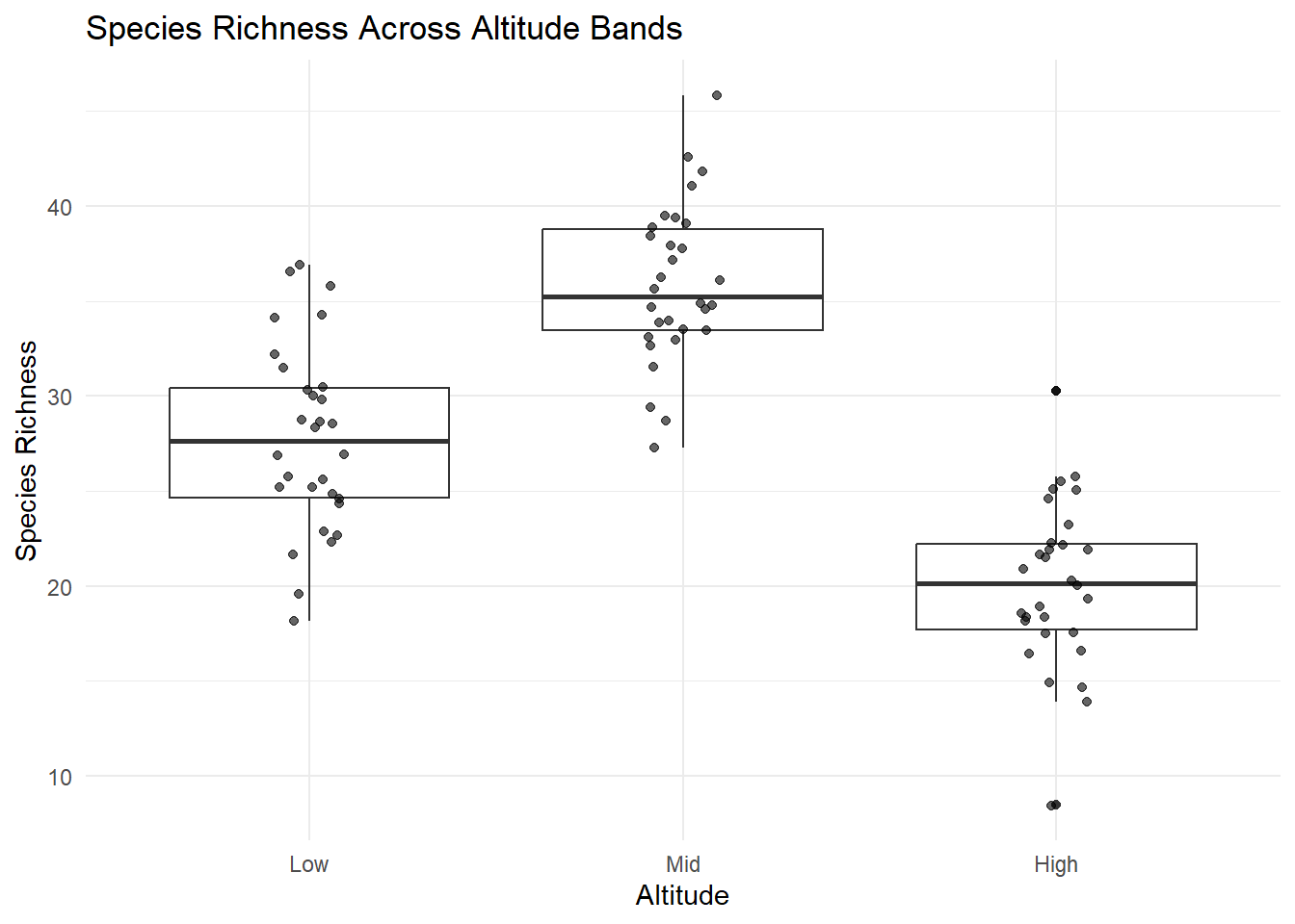
Optional: You can also present a set of histograms, see the two sample t test example for some code and inspiration.
Assumptions
| Assumption | Check | Met |
|---|---|---|
| Equal variances | In the plots the spread looks similar in the three groups (Low, Mid and High) and the standard deviations are similar (4.91, 4.18 and 4.35 for Low, Mid and High respectively). The ratio of the largest sd to the smallest sd is 4.91/3.18 = 1.17 which is less than 2. | This assumption is met. |
| Normally distributed residuals | Box and whisker plots with the data suggests symmetric and fairly bell-shaped measurements for all groups, and the sample size is the same in each group. | This assumption is met. |
| Independence | This data simulated, we can assume independence. | This assumption is not relevant. |
Modelling
## Run the one-way ANOVA

altitude_aov <- aov(Richness ~ Altitude, data = altitude)
summary(altitude_aov)
Df Sum Sq Mean Sq F value Pr(>F)
Altitude 2 3731 1865.7 92.65 <2e-16 ***
Residuals 87 1752 20.1
---
Signif. codes: 0 '***' 0.001 '**' 0.01 '*' 0.05 '.' 0.1 ' ' 1## as the overall p-value is significant we can also run post hoc tests
TukeyHSD(altitude_aov) Tukey multiple comparisons of means
95% family-wise confidence level
Fit: aov(formula = Richness ~ Altitude, data = altitude)
$Altitude
diff lwr upr p adj
Mid-Low 8.127210 5.364459 10.889962 0
High-Low -7.642379 -10.405131 -4.879627 0
High-Mid -15.769590 -18.532342 -13.006838 0Report ready interpretation
A full interpretation of a analysis includes
- A conclusion with respect to the null hypothesis, supported by a p-value
- A summary of what we learn from the modelling (samples means)
- Interpretation of the Tukey Honest Significant Differences
- Any assumptions or caveats made along the way
For this model we have the following interpretation:
We have evidence against the null hypothesis that the population means of number of native plant species at the three altitudes are the same (p-value <0.001). The mean count of native species is 27.8 for the low altitude group, 35.9 for the mid altitude group and 20.1 for the high altitude group. Tukey honest significant differences showed difference between all three pairs of altitudes namely
- Mid-low has a difference, on average, of 8.12 species (95% CI 5.36 to 10.9)
- Low-high has a difference, on average, of 7.64 species (95% CI 4.87 to 10.4)
- High-mid has a difference, on average, of 15.8 species (95% CI 13.0 to 18.5)
This was simulated data but no further assumptions were made during analysis.
Why Log scale
In many ecological systems, such as island size, values often are non-linear which does not meet the assumptions of linear models (like in this prac). Many small islands vs few large islands.
If you tried to fit island size with species richness, it wont work well because the relationship is curved (left figure). If you log transform island size (island_area_log) and species richness (species_richness_log), the relationship looks more linear (right figure).
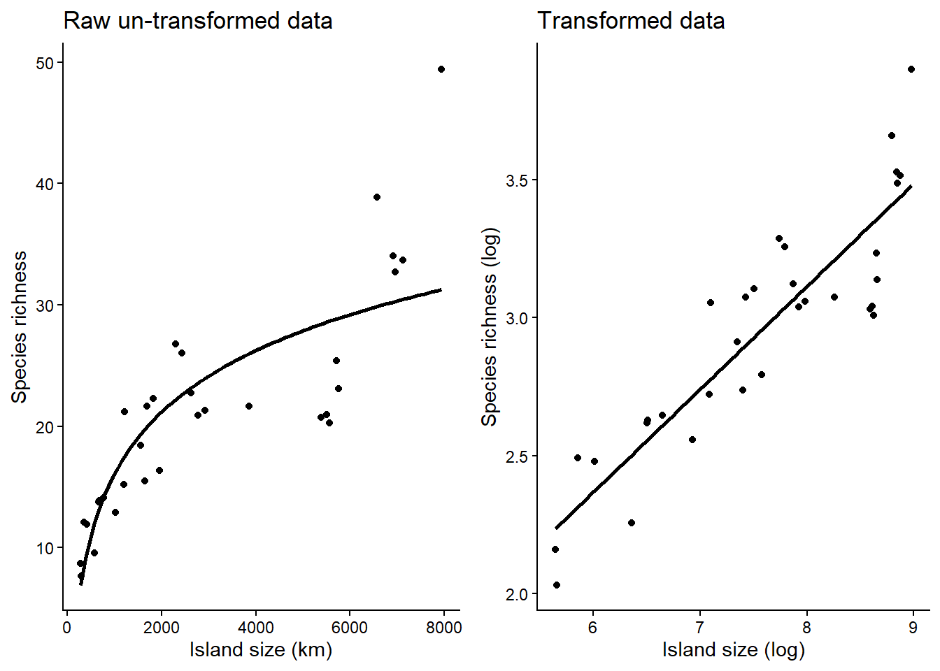
By log transforming:
- It stabilises variance: Ecological data often have variance that increases with the mean (e.g., larger islands have both more species and more variability). Raw data has fan-shaped” spread while log transforming evens the spread
- it reduces the influence of extreme values.
- It improves interpretability of parameters: The slope z becomes a scaling exponent.
- It often makes data more “normal”: Many statistical methods assume normally distributed residuals. Log transformation can reduce skewness
When not to log-transform:
- You have zeros like count data (can’t log zeros)
- The relationship is already linear
- Interpretation on the original scale is critical
If you need to log transform your data, here is how to do it:
# new_data is whatever data object you have
# x_value is whatever the name of the data column you want to log transform.

new_data <- new_data %>%
  mutate(x_value_log = log(x_value))
Assessment
Task to complete before the end of the workshop.
Island size may be associated with the species richness of herbivores. This simulated data set allows us to use the statistical inference process we would implement if investigating this relationship is a similar manner to Ross et al. (2019), figure 3 top right sub figure.
First download the island.csv file on GitHub in the ‘data’ folder and load it in R.
# Week 5 workshop - Inference
# Written by Nicholas Wu, 06/11/2024, Murdoch University

# Load packages
library(EcoData)
library(tidyverse)
library(broom)
library(psych)

# Set your working directory
setwd("YOUR-DIRECTORY")

# Load your data
island <- read_csv("island.csv")
Note that in island.csv both island area is on the log scale.
Your tasks are to:
1. Create a scatterplot and check if the data suggests a linear relationship
2. Create the other visualisations for diagnostics checking
- Create one figure to look at the assumption of equal variances.
- Create one figure to look at the assumption that the residuals have a normal distribution
- Optional: Plot leverage versus the standardised residual plots and note if there are any concerning high leverage points.
- Decide if simple linear regression is suitable for this data or not
3. Provide a summary of the model and visualise the model
- Report the p-value in context (you can write this as a comment in the code)
- Report the slope and confidence interval (you can write this as a comment in the code too)
- Overlay the linear model on the scatterplot